Edit chart
Loading graph
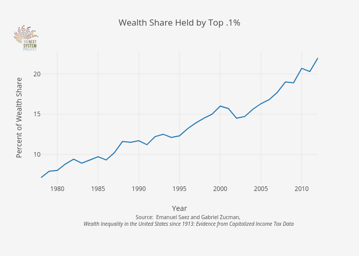
Jduda's interactive graph and data of "Wealth Share Held by Top .1%" is a line chart, showing B; with Year in the x-axis and Percent of Wealth Share in the y-axis.. The x-axis shows values from 1978 to 2012. The y-axis shows values from 6.272222222222222 to 22.82777777777778. This visualization has the following annotation: Source: Emanuel Saez and Gabriel Zucman, Wealth Inequality in the United States since 1913: Evidence from Capitalized Income Tax Data