Edit chart
Loading graph
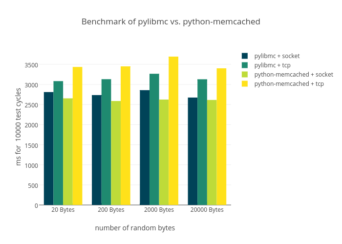
Jensens's interactive graph and data of "Benchmark of pylibmc vs. python-memcached" is a bar chart, showing pylibmc + socket, pylibmc + tcp, python-memcached + socket, python-memcached + tcp; with number of random bytes in the x-axis and ms for 10000 test cycles in the y-axis.. The x-axis shows values from -0.5 to 3.5. The y-axis shows values from 0 to 3886.7707001535514.