Edit chart
Loading graph
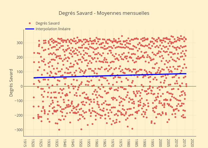
Jhroy's interactive graph and data of "Degrés Savard - Moyennes mensuelles" is a scatter chart, showing Degrés Savard vs Interpolation linéaire; with time in the x-axis and Degrés Savard in the y-axis.. The x-axis shows values from -1762933423434.992 to 1633974223434.992. The y-axis shows values from -344.62854209445584 to 392.0285420944558.