Edit chart
Loading graph
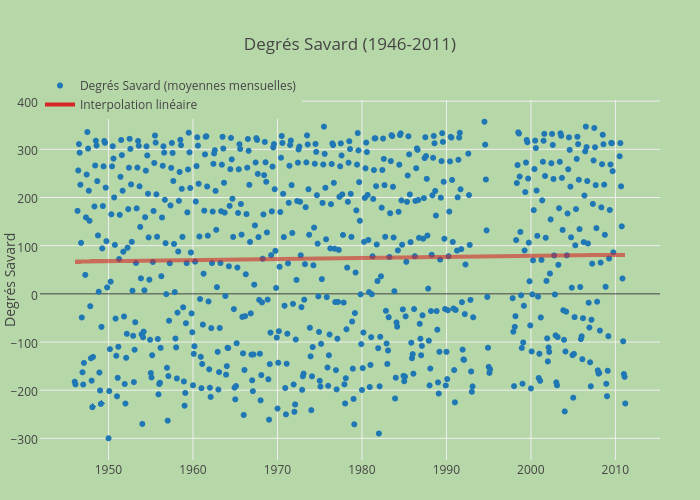
Jhroy's interactive graph and data of "Degrés Savard (1946-2011)" is a scatter chart, showing Degrés Savard (moyennes mensuelles) vs Interpolation linéaire; with Degrés Savard in the y-axis. The x-axis shows values from -882538550076.5697 to 1424129750076.5698. The y-axis shows values from -345.62718685831624 to 403.0871868583163.