Edit chart
Loading graph
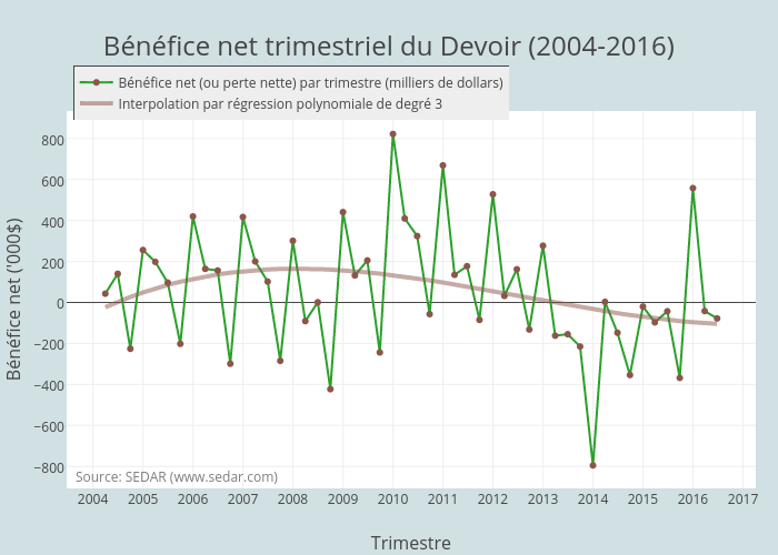
Jhroy's interactive graph and data of "Bénéfice net trimestriel du Devoir (2004-2016)" is a line chart, showing Bénéfice net (ou perte nette) par trimestre (milliers de dollars) vs Interpolation par régression polynomiale de degré 3; with Trimestre in the x-axis and Bénéfice net ('000$) in the y-axis.. The x-axis shows values from 1057093181832.8623 to 1490443218167.1377. The y-axis shows values from -904.8140569395018 to 931.8140569395018. This visualization has the following annotation: Source: SEDAR (www.sedar.com)