Edit chart
Loading graph
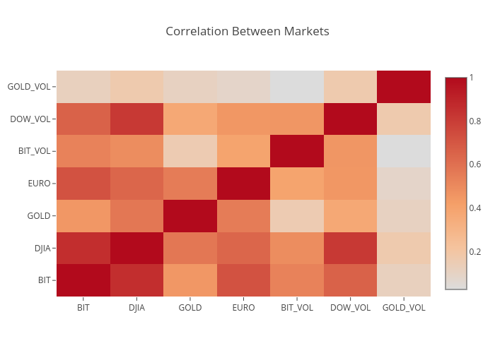
Jigull's interactive graph and data of "Correlation Between Markets" is a heatmap. The x-axis shows values from 0 to 0. The y-axis shows values from 0 to 0.