Edit chart
Loading graph
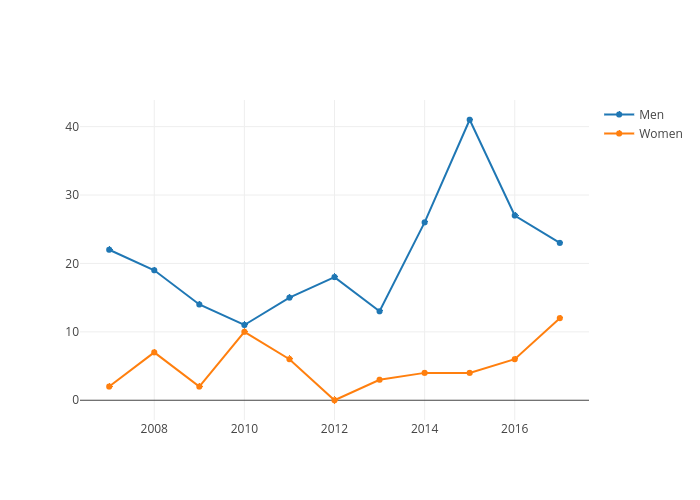
Joshua-t-loong's interactive graph and data of "Toronto Shelter Deaths Over Time" is a scatter chart, showing Men vs Women. The x-axis shows values from 0 to 0. The y-axis shows values from 0 to 0.