Edit chart
Loading graph
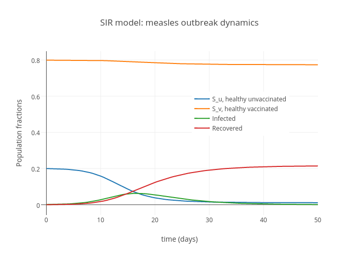
Jslandy's interactive graph and data of "SIR model: measles outbreak dynamics" is a scatter chart, showing S_u, healthy unvaccinated, S_v, healthy vaccinated, Infected, Recovered; with time (days) in the x-axis and Population fractions in the y-axis.. The x-axis shows values from -0.9843873318122647 to 50.02567966952554. The y-axis shows values from -0.05714216942726169 to 0.8485699091076029.