1960
1970
1980
1990
2000
2010
2
4
6
8
10
12
14
16
tot. US crime
Alabama
California
Illinois
Massachusetts
Missouri
New York
Tennessee
Wyoming
Year
Average number of murders per 100,000 people
plotly-logomark
Edit chart
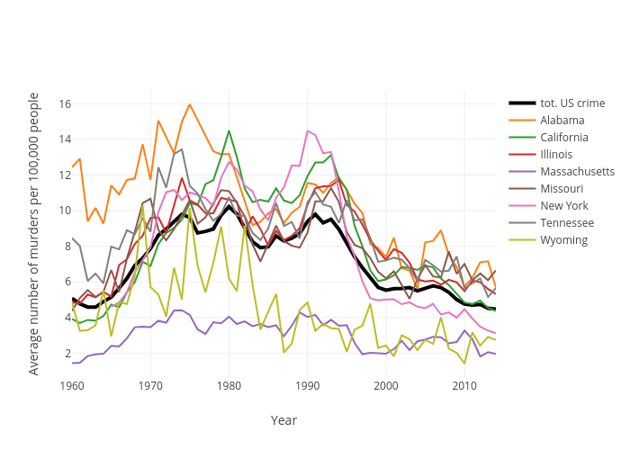
Juliettapc's interactive graph and data of "Average number of murders per 100,000 people vs Year" is a line chart, showing tot. US crime, Alabama, California, Illinois, Massachusetts, Missouri, New York, Tennessee, Wyoming; with Year in the x-axis and Average number of murders per 100,000 people in the y-axis.. The x-axis shows values from 1960 to 2014. The y-axis shows values from 0.6087899493999998 to 16.7739468314.