Edit chart
Loading graph
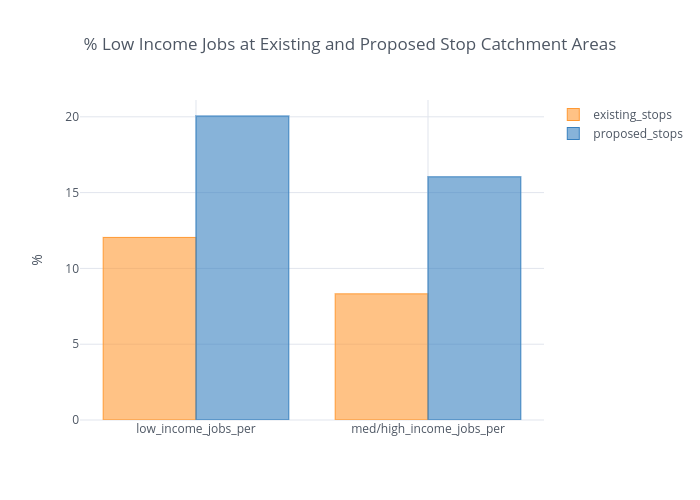
Katembeck's interactive graph and data of "% Low Income Jobs at Existing and Proposed Stop Catchment Areas" is a bar chart, showing existing_stops vs proposed_stops. The x-axis shows values from 0 to 0. The y-axis shows values from 0 to 0.