Edit chart
Loading graph
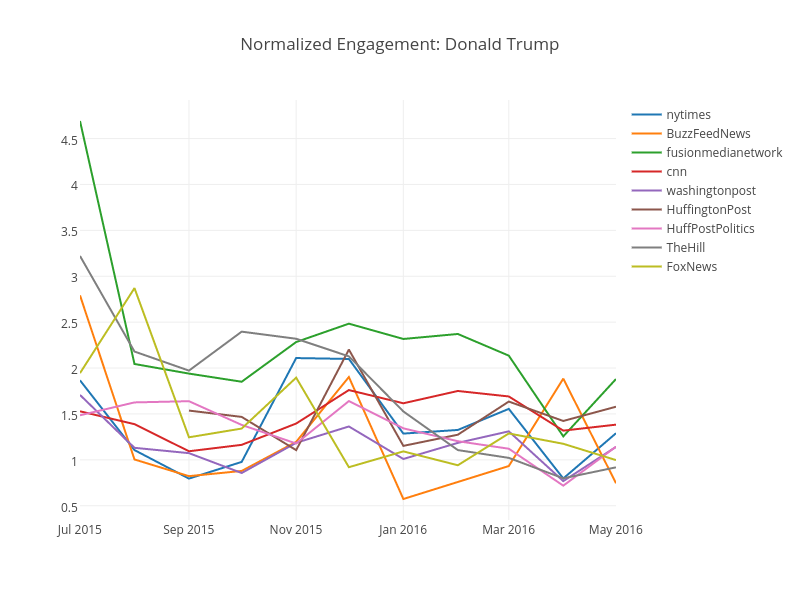
Kstohr's interactive graph and data of "Normalized Engagement: Donald Trump" is a line chart, showing nytimes, BuzzFeedNews, fusionmedianetwork, cnn, washingtonpost, HuffingtonPost, HuffPostPolitics, TheHill, FoxNews; with time in the x-axis. The x-axis shows values from 1435734000000 to 1462086000000. The y-axis shows values from 0.34457865723174785 to 4.9202741356216215.