Edit chart
Loading graph
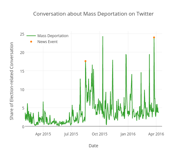
Kstohr's interactive graph and data of "Conversation about Mass Deportation on Twitter" is a scatter chart, showing Mass Deportation vs News Event; with Date in the x-axis and Share of Election-related Conversation in the y-axis.. The x-axis shows values from 0 to 0. The y-axis shows values from 0 to 0.