Edit chart
Loading graph
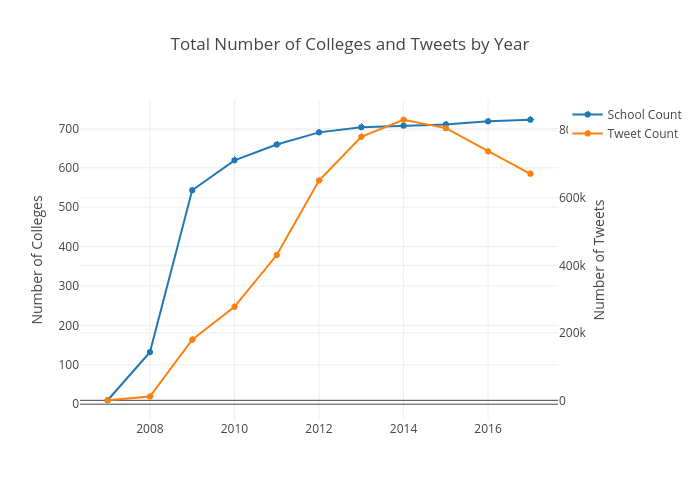
Lauren.n.dahlin's interactive graph and data of "Total Number of Colleges and Tweets by Year" is a scatter chart, showing School Count vs Tweet Count; with Number of Colleges in the y-axis. The x-axis shows values from 0 to 0. The y-axis shows values from 0 to 0.