Edit chart
Loading graph
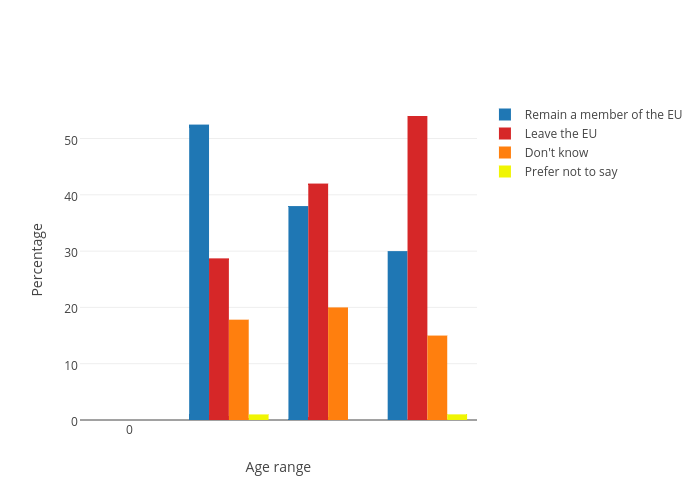
Ldoma001's interactive graph and data of "Percentage vs Age range" is a grouped bar chart, showing Remain a member of the EU, Leave the EU, Don't know, Prefer not to say; with Age range in the x-axis and Percentage in the y-axis.. The x-axis shows values from -0.5 to 2.5. The y-axis shows values from 0 to 56.8421052631579.