Edit chart
Loading graph
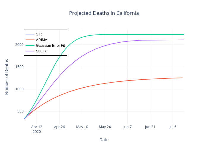
Leowang7767's interactive graph and data of "Projected Deaths in California" is a line chart, showing SIR, ARIMA, Gaussian Error Fit, SuEIR; with Date in the x-axis and Number of Deaths in the y-axis.. The x-axis shows values from 0 to 0. The y-axis shows values from 0 to 0.