Edit chart
Loading graph
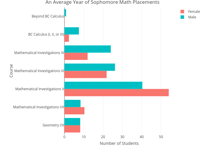
Lliu12's interactive graph and data of "An Average Year of Sophomore Math Placements" is a grouped bar chart, showing Female vs Male; with Number of Students in the x-axis and Course in the y-axis.. The x-axis shows values from 0 to 0. The y-axis shows values from 0 to 0.