Edit chart
Loading graph
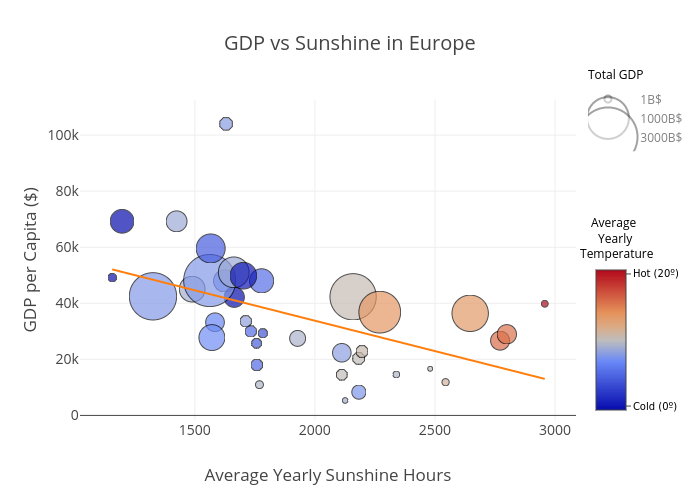
Michetonu's interactive graph and data of "GDP vs Sunshine in Europe" is a scatter chart, showing 1B$, 1000B$, 3000B$; with Average Yearly Sunshine Hours in the x-axis and GDP per Capita ($) in the y-axis.. The x-axis shows values from 1037.476660591402 to 3072.3991073352286. The y-axis shows values from -1787.6564182556158 to 112821.21327738314. This visualization has the following annotations: Total GDP; Average Yearly Temperature