Edit chart
Loading graph
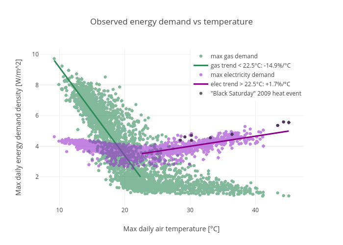
Mlip's interactive graph and data of "Observed energy demand vs temperature" is a scatter chart, showing max gas demand, gas trend 22.5°C: +1.7%/°C, "Black Saturday" 2009 heat event; with Max daily air temperature [°C] in the x-axis and Max daily energy demand density [W/m^2] in the y-axis.. The x-axis shows values from 0 to 0. The y-axis shows values from 0 to 0.