Edit chart
Loading graph
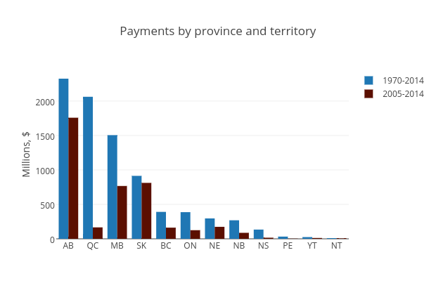
Mwarzecha's interactive graph and data of "Payments by province and territory" is a bar chart, showing 1970-2014 vs 2005-2014; with Millions, $ in the y-axis. The x-axis shows values from -0.5 to 11.5. The y-axis shows values from 0 to 2447.3684210526317.