20
40
60
80
100
120
20
40
60
80
100
120
140
day
night
Red Average vs. Blue Average
redAvg
blueAvg
plotly-logomark
Edit chart
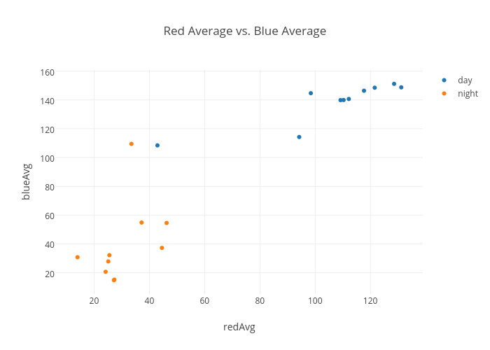
Nbui's interactive graph and data of "Red Average vs. Blue Average" is a scatter chart, showing day vs night; with redAvg in the x-axis and blueAvg in the y-axis.. The x-axis shows values from 6.461980872709639 to 138.64358869531563. The y-axis shows values from 5.474846853787962 to 160.5401241872102.