20
40
60
80
100
120
20
40
60
80
100
120
140
day
night
Red Average vs. Green Average
redAvg
greenAvg
plotly-logomark
Edit chart
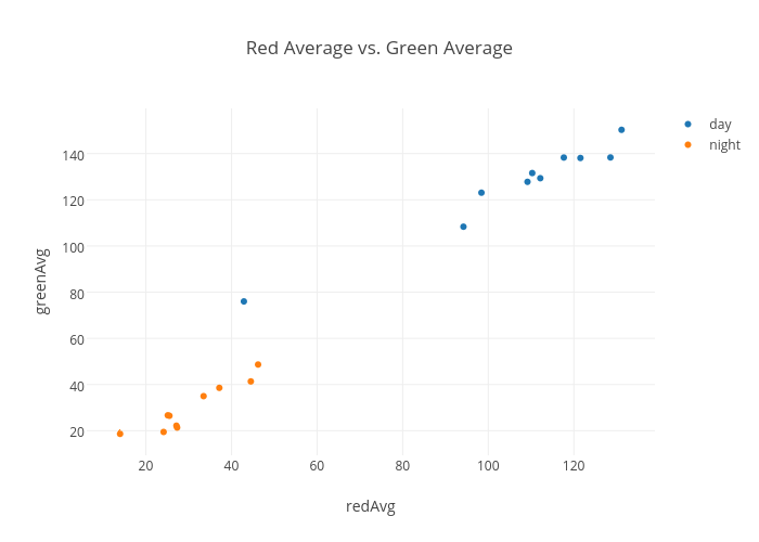
Nbui's interactive graph and data of "Red Average vs. Green Average" is a scatter chart, showing day vs night; with redAvg in the x-axis and greenAvg in the y-axis.. The x-axis shows values from 6.558977099326851 to 138.5465924686984. The y-axis shows values from 9.371089431981472 to 159.56516074741003.