Edit chart
Loading graph
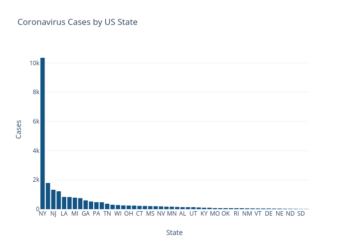
Nickmccullum's interactive graph and data of "Coronavirus Cases by US State" is a bar chart; with State in the x-axis and Cases in the y-axis.. The x-axis shows values from -0.5 to 49.5. The y-axis shows values from 0 to 10901.052631578947.