Edit chart
Loading graph
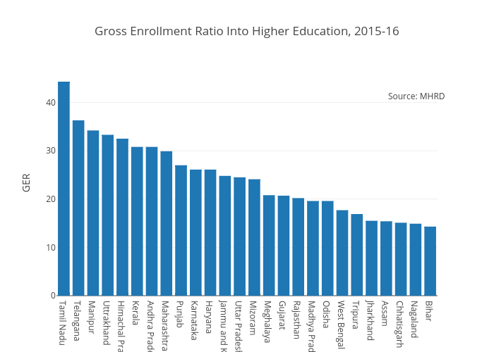
Nilakar's interactive graph and data of "Gross Enrollment Ratio Into Higher Education, 2015-16" is a bar chart, showing ; with GER in the y-axis. The x-axis shows values from -0.5 to 25.5. The y-axis shows values from 0 to 46.63157894736842. This visualization has the following annotation: Source: MHRD