Edit chart
Loading graph
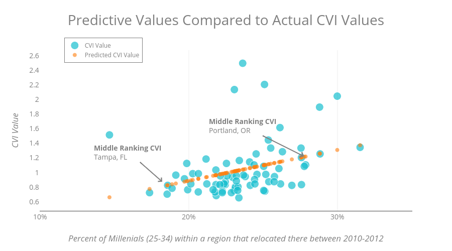
Nsstephan's interactive graph and data of "Predictive Values Compared to Actual CVI Values" is a scatter chart, showing CVI Value vs Predicted CVI Value; with Percent of Millenials (25-34) within a region that relocated there between 2010-2012 in the x-axis and CVI Value in the y-axis.. The x-axis shows values from 10 to 35. The y-axis shows values from 0.46149253731343287 to 2.658507462686567. This visualization has the following annotations: Middle Ranking CVIPortland, OR; Middle Ranking CVI Tampa, FL