Edit chart
Loading graph
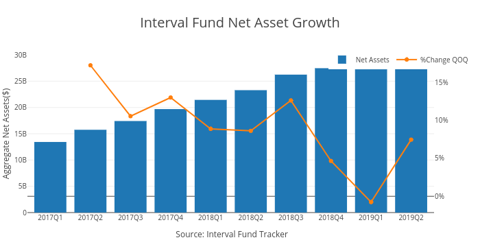
Ockhamdata's interactive graph and data of "Interval Fund Net Asset Growth" is a bar chart, showing Net Assets vs %Change QOQ; with Source: Interval Fund Tracker in the x-axis and Aggregate Net Assets($) in the y-axis.. The x-axis shows values from -0.5715102974828374 to 9.571510297482835. The y-axis shows values from 0 to 30000000000.