Edit chart
Loading graph
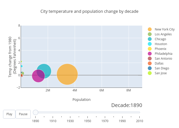
Omiltner13's interactive graph and data of "City temperature and population change by decade" is a scatter chart, showing New York City, Los Angeles, Chicago, Houston, Phoenix, Philadelphia, San Antonio, Dallas, San Diego, San Jose; with Population in the x-axis and Temp change from 1980 (Degrees Fahrenheit) in the y-axis.. The x-axis shows values from 1000 to 9000000. The y-axis shows values from -2 to 8.