0.75
0.8
0.85
0.9
0.95
1
0.5
0.6
0.7
0.8
0.9
1
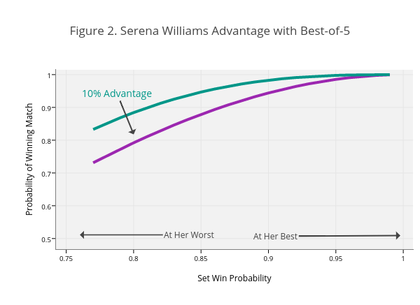
Figure 2. Serena Williams Advantage with Best-of-5
Set Win Probability
Probability of Winning Match
At Her Best
At Her Worst
10% Advantage
plotly-logomark
Edit chart
On-the-t's interactive graph and data of "Figure 2. Serena Williams Advantage with Best-of-5" is a line chart, showing Best-of-3 vs Best-of-5; with Set Win Probability in the x-axis and Probability of Winning Match in the y-axis.. The x-axis shows values from 0.7424264555162885 to 1.0072166321729497. The y-axis shows values from 0.4676193415290483 to 1.0147064833816557. This visualization has the following annotations: At Her Best; At Her Worst; 10% Advantage