Edit chart
Loading graph
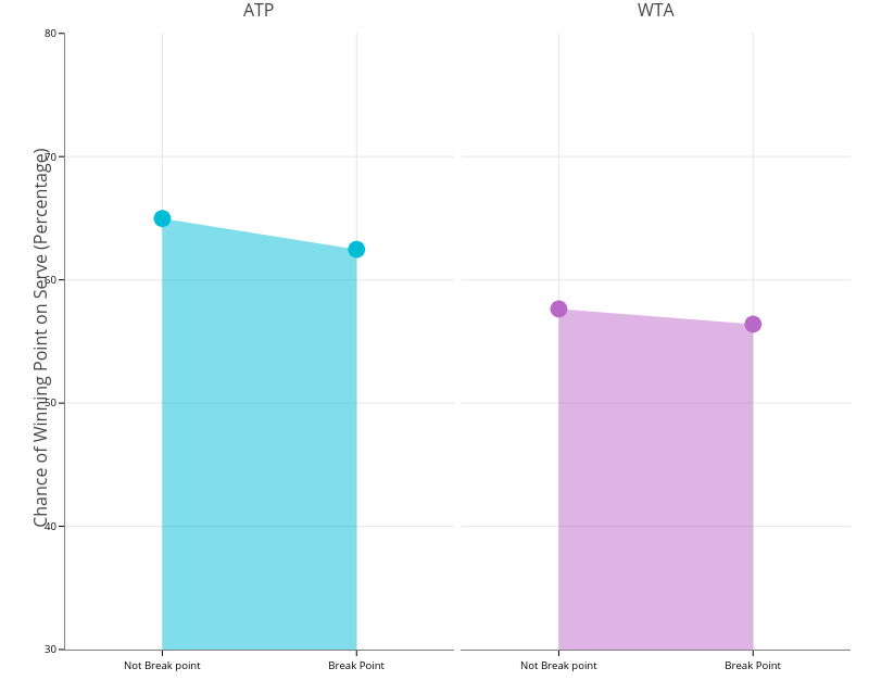
On-the-t's interactive graph and data of "ATP vs WTA" is a filled scatter chart, showing ATP vs WTA. The x-axis shows values from -0.5 to 1.5. The y-axis shows values from 30 to 80. This visualization has the following annotations: ATP; WTA; Chance of Winning Point on Serve (Percentage)