Edit chart
Loading graph
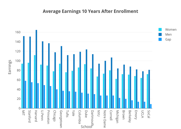
Plotly2_demo's interactive graph and data of "Average Earnings 10 Years After Enrollment" is a grouped bar chart, showing Women, Men, Gap; with School in the x-axis and Earnings in the y-axis.. The x-axis shows values from -0.5 to 20.5. The y-axis shows values from 0 to 173.68421052631578.