Edit chart
Loading graph
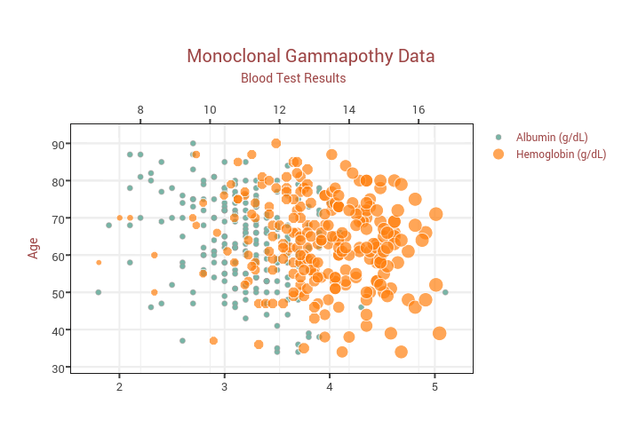
Plotly2_demo's interactive graph and data of "Monoclonal Gammapothy Data" is a scatter chart, showing Albumin (g/dL) vs Hemoglobin (g/dL); with Age in the y-axis. The x-axis shows values from 1.5909227683049147 to 5.309077231695085. The y-axis shows values from 28.53287197231834 to 94.96885813148789. This visualization has the following annotation: Blood Test Results