Edit chart
Loading graph
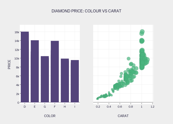
Plotly2_demo's interactive graph and data of "DIAMOND PRICE: COLOUR VS CARAT" is a bar chart, showing COLOUR vs price; with COLOR in the x-axis and PRICE in the y-axis.. The x-axis shows values from -0.5 to 5.5. The y-axis shows values from -416.46324159975075 to 17509.41186559601.