Edit chart
Loading graph
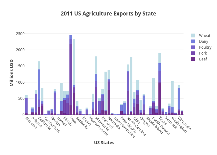
Plotly2_demo's interactive graph and data of "2011 US Agriculture Exports by State" is a stacked bar chart, showing Beef, Pork, Poultry, Dairy, Wheat; with US States in the x-axis and Millions USD in the y-axis.. The x-axis shows values from -0.5 to 49.5. The y-axis shows values from 0 to 2580.1052631578946.