Edit chart
Loading graph
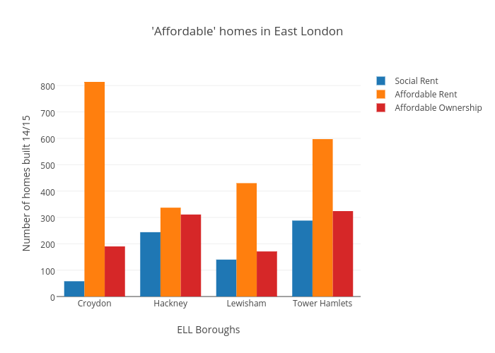
Pmmcgowan's interactive graph and data of "'Affordable' homes in East London" is a bar chart, showing Social Rent, Affordable Rent, Affordable Ownership; with ELL Boroughs in the x-axis and Number of homes built 14/15 in the y-axis.. The x-axis shows values from -0.5 to 3.5. The y-axis shows values from 0 to 856.8421052631579.