Edit chart
Loading graph
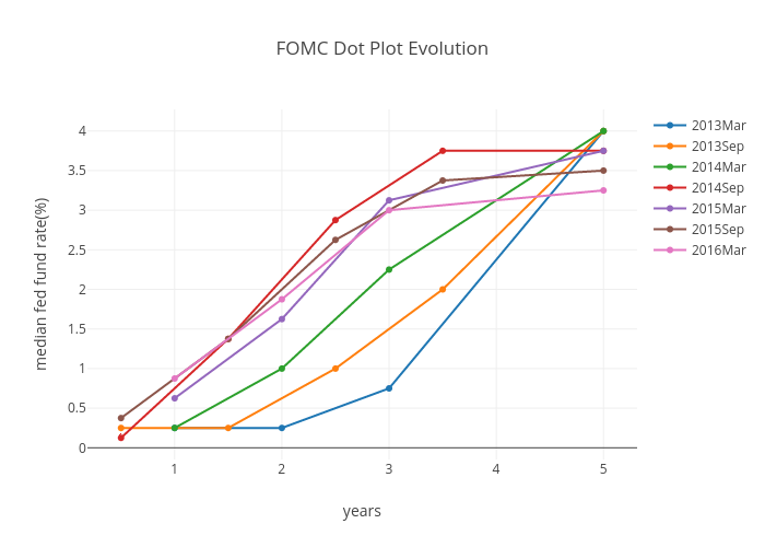
Prodiptag's interactive graph and data of "FOMC Dot Plot Evolution" is a scatter chart, showing 2013Mar, 2013Sep, 2014Mar, 2014Sep, 2015Mar, 2015Sep, 2016Mar; with years in the x-axis and median fed fund rate(%) in the y-axis.. The x-axis shows values from 0 to 0. The y-axis shows values from 0 to 0.