Edit chart
Loading graph
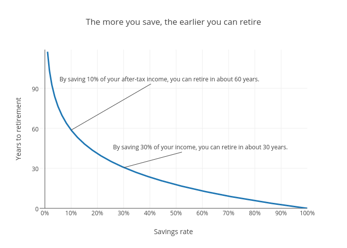
Ptweir's interactive graph and data of "The more you save, the earlier you can retire" is a scatter chart, showing Time to retire (years); with Savings rate in the x-axis and Years to retirement in the y-axis.. The x-axis shows values from -2 to 100. The y-axis shows values from 0 to 119. This visualization has the following annotations: By saving 10% of your after-tax income, you can retire in about 60 years.; By saving 30% of your income, you can retire in about 30 years.