Edit chart
Loading graph
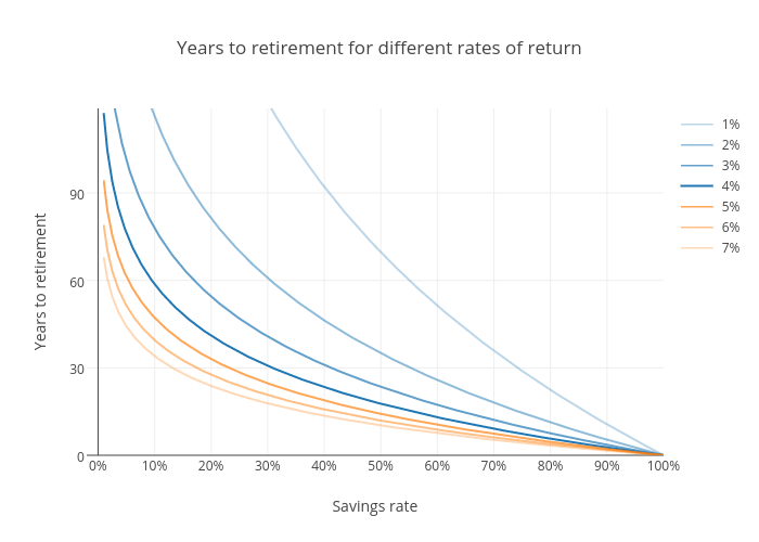
Ptweir's interactive graph and data of "Years to retirement for different rates of return" is a line chart, showing 1%, 2%, 3%, 4%, 5%, 6%, 7%; with Savings rate in the x-axis and Years to retirement in the y-axis.. The x-axis shows values from -2 to 100. The y-axis shows values from 0 to 119.