Edit chart
Loading graph
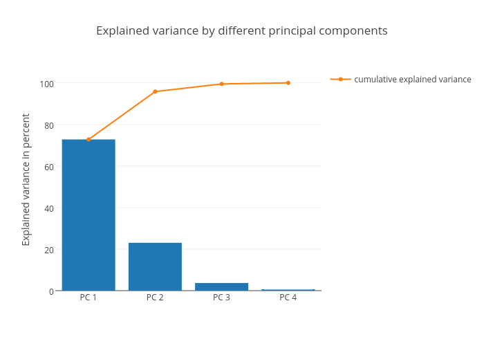
Rasbt's interactive graph and data of "Explained variance by different principal components" is a bar chart, showing cumulative explained variance; with Explained variance in percent in the y-axis. The x-axis shows values from 0 to 0. The y-axis shows values from 0 to 0.