Edit chart
Loading graph
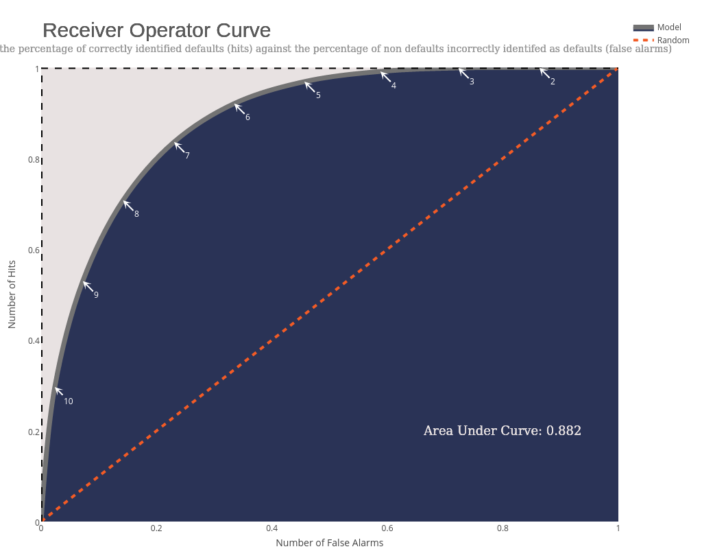
Riddhiman's interactive graph and data of "Number of Hits vs Number of False Alarms" is a filled line chart, showing Model vs Random; with Number of False Alarms in the x-axis and Number of Hits in the y-axis.. The x-axis shows values from 0 to 1. The y-axis shows values from 0 to 1. This visualization has the following annotations: Area Under Curve: 0.882; Area Under Curve: 0.882; Area Under Curve: 0.882; Receiver Operator Curve; Receiver Operator Curve; Receiver Operator Curve; Charts the percentage of correctly identified defaults (hits) against the percentage of non defaults incorrectly identifed as defaults (false alarms); Charts the percentage of correctly identified defaults (hits) against the percentage of non defaults incorrectly identifed as defaults (false alarms); Charts the percentage of correctly identified defaults (hits) against the percentage of non defaults incorrectly identifed as defaults (false alarms)