Edit chart
Loading graph
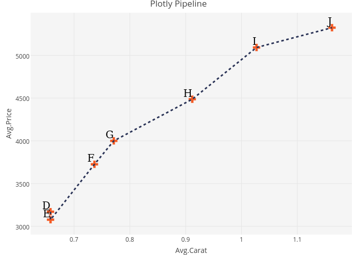
Riddhiman's interactive graph and data of "Plotly Pipeline" is a scatter chart; with Avg.Carat in the x-axis and Avg.Price in the y-axis.. The x-axis shows values from 0 to 0. The y-axis shows values from 0 to 0.