Edit chart
Loading graph
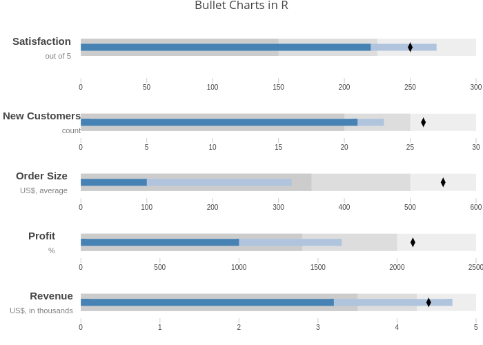
Riddhiman's interactive graph and data of "Bullet Charts in R" is a line chart, showing Range3, [], [], [], [], [], Range3, [], [], [], [], [], Range3, [], [], [], [], [], Range3, [], [], [], [], [], Range3, [], [], [], [], []. The x-axis shows values from -30 to 300. The y-axis shows values from -1 to 1. This visualization has the following annotations: RevenueUS$, in thousands; Profit%; Order SizeUS$, average; New Customerscount; Satisfactionout of 5