Edit chart
Loading graph
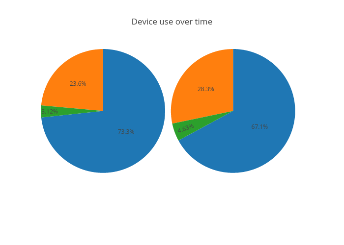
Rrighart's interactive graph and data of "Device use over time" is a pie, showing 1st Week vs 2nd Week. The x-axis shows values from 0 to 0. The y-axis shows values from 0 to 0.