Edit chart
Loading graph
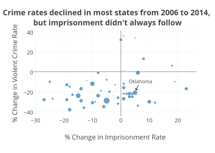
Ryan.gentzler's interactive graph and data of "Crime rates declined in most states from 2006 to 2014, but imprisonment didn't always follow" is a scatter chart, showing C; with % Change in Imprisonment Rate in the x-axis and % Change in Violent Crime Rate in the y-axis.. The x-axis shows values from -30.257779751189865 to 26.261355924832834. The y-axis shows values from -43.8974216220203 to 40.91335264593128. This visualization has the following annotation: Oklahoma