Edit chart
Loading graph
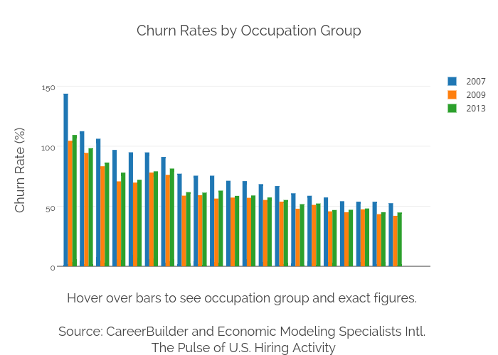
Ryan.hunt14's interactive graph and data of "Churn Rates by Occupation Group" is a grouped bar chart, showing 2007, 2009, 2013; with Hover over bars to see occupation group and exact figures. Source: CareerBuilder and Economic Modeling Specialists Intl. The Pulse of U.S. Hiring Activity in the x-axis and Churn Rate (%) in the y-axis.. The x-axis shows values from -0.8140590247414541 to 22.163600933067972. The y-axis shows values from -2.9266018609133475 to 162.64973154437476.