Edit chart
Loading graph
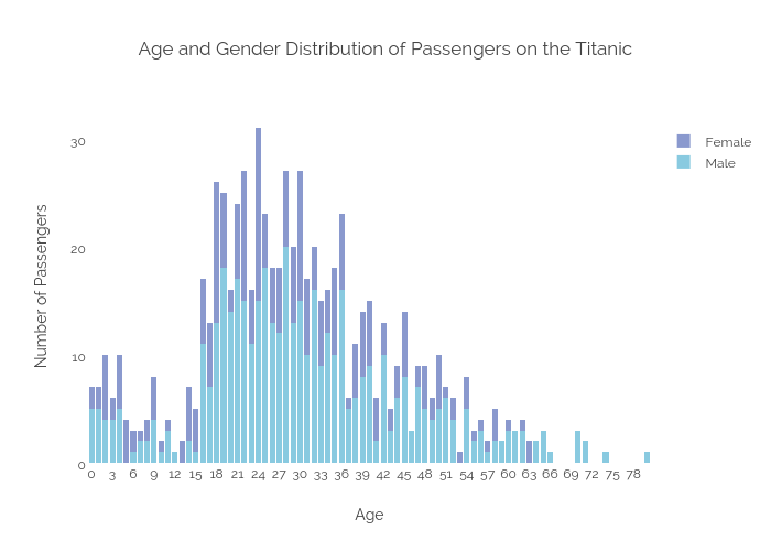
Sagarwal88's interactive graph and data of "Age and Gender Distribution of Passengers on the Titanic" is a stacked bar chart, showing Male vs Female; with Age in the x-axis and Number of Passengers in the y-axis.. The x-axis shows values from -0.5 to 80.5. The y-axis shows values from 0 to 32.631578947368425. This visualization has the following annotation: