Edit chart
Loading graph
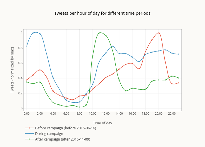
Smith-erik's interactive graph and data of "Tweets per hour of day for different time periods" is a line chart, showing Before campaign (before 2015-06-16), During campaign, After campaign (after 2016-11-09); with Time of day in the x-axis and Tweets (normalized by max) in the y-axis.. The x-axis shows values from -0.4873809523809526 to 23.457261904761904. The y-axis shows values from -0.03295454545454546 to 1.0462556752190897.