Edit chart
Loading graph
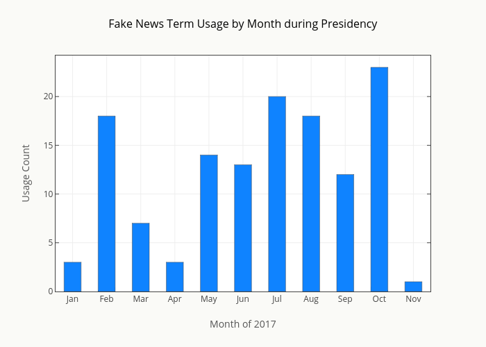
Smith-erik's interactive graph and data of "Fake News Term Usage by Month during Presidency" is a bar chart, showing y; with Month of 2017 in the x-axis and Usage Count in the y-axis.. The x-axis shows values from -0.5 to 10.5. The y-axis shows values from 0 to 24.210526315789473.