Edit chart
Loading graph
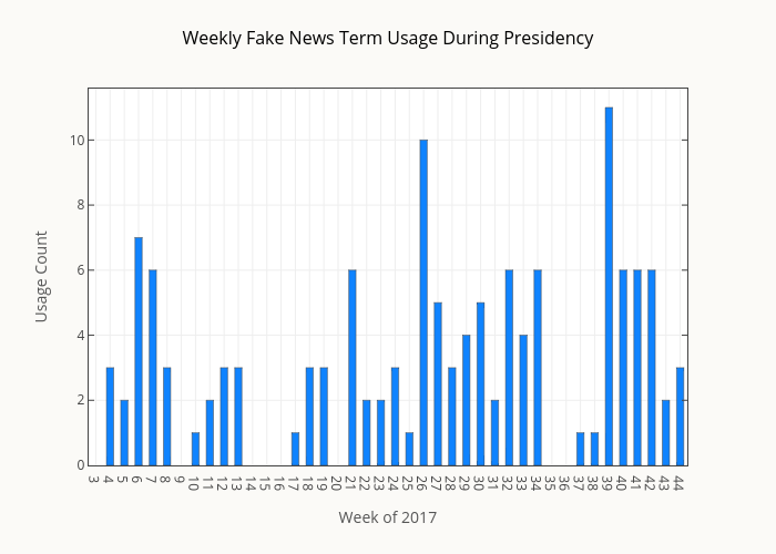
Smith-erik's interactive graph and data of "Weekly Fake News Term Usage During Presidency" is a bar chart, showing y; with Week of 2017 in the x-axis and Usage Count in the y-axis.. The x-axis shows values from 2.5 to 44.5. The y-axis shows values from 0 to 11.578947368421053.