Edit chart
Loading graph
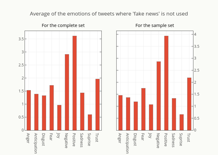
Smith-erik's interactive graph and data of "Average of the emotions of tweets where 'fake news' is not used" is a bar chart, showing Trace 0, y vs Trace 1, y. The x-axis shows values from -0.5 to 9.5. The y-axis shows values from 0 to 3.8038277511961724. This visualization has the following annotations: For the complete set; For the sample set