Edit chart
Loading graph
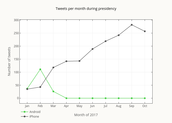
Smith-erik's interactive graph and data of "Tweets per month during presidency" is a line chart, showing Android vs iPhone; with Month of 2017 in the x-axis and Number of tweets in the y-axis.. The x-axis shows values from -0.5501002004008015 to 9.550100200400802. The y-axis shows values from -19.069504778453524 to 301.0695047784535.