Edit chart
Loading graph
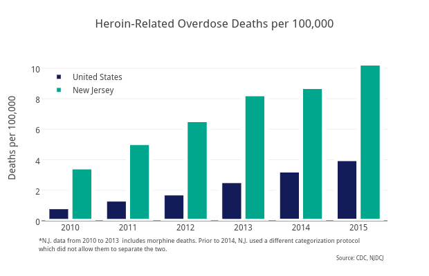
Sstirling's interactive graph and data of "Heroin-Related Overdose Deaths per 100,000" is a bar chart, showing United States vs New Jersey; with Deaths per 100,000 in the y-axis. The x-axis shows values from 2009.5 to 2015.5. The y-axis shows values from 0 to 10.852631578947369. This visualization has the following annotations: *N.J. data from 2010 to 2013 includes morphine deaths. Prior to 2014, N.J. used a different categorization protocol which did not allow them to separate the two. ; Source: CDC, NJDCJ